 Since 2012 to February 2020 I used Graphene theme and many customers complained that my website looks ugly, ancient, designed in 1990s “is so poorly designed that at first impression I though that is a SCAM site, but I gave a second change and saw that you have great products“.
In March 2020 I purchased Vogue theme from KairaWeb.com and most people said that is a major improvement, but some still said that looks like in 1990s, motivating lack of any animations, so I added custom CSS codes to make images flashing or menus enlarging when you hover mouse cursor.
In early 2021 I showed to some of YOU few WordPress themes including Astra, Kadence and Neve, YOU said that they are great, on 1 May 2021 I purchased Neve theme from ThemeIsle.com and and played few hours with theme built-in customizer + added my own custom CSS. Now some of YOU said “did you really bought theme? Your website looks same 1990s SHIT like before“.
Vogue theme had 4 header options, left-aligned, center-aligned, with and without social media. Neve theme is flexible and header is a grid of 3 rows / 12 columns and I can place logo, title, menu, search box, social media buttons ANYWHERE and set color individually for each element. I can customize up to limit of imagination… the only problem is my lack of imagination / I screw up any theme with my BAD tastes of graphic design, what I like, most people don’t like.
So I want to ask YOU what changes would you do at my website design? Instead of “your theme is 1990s SHIT, change it“, please can tell me exactly what to CHANGE to make my website more modern, for example “change menu background color to blue”, or “increase title font size”, etc. I don’t care if you are web developer or an average man browsing internet, I take in consideration EVERYONE’s feedback since website target everyone, not only web developers. But if you are web developer experienced in CSS you can right click > inspect element and do yourself changes, then send me a screenshot.
Most negative reviews seems to be about color palette. Once time ago website was highly colored, with dark blue background for header and titles, people complained “too many colors“, then I changed to fully white background and added lines to separate elements, people complained again “too simple and bland“. I tried an intermediate solution with different shades of gray for header, menu, page background, while posts remained white. People kept complaining!
Please DON’T say “pay me $2000 and I will make you most awesome theme“, because there is NO guarantee that I or my visitors will like your custom theme, and a custom theme “made just for me” will have NO flexibility so I am required to pay again developer each time I want a change. You can recommend me themes freely available on wordpress.org/themes, or paid versions of these themes (most themes cost $20-100/year), that have at least 5000 active installations thus I can expect free updates and bug fixes in the future.
My way to website design
I never took courses of web development, I self-taught to “show off” to friends what I can do myself without paying any web developer, I made my first website in 2009 http://teoalida.webs.com and been aware of CSS as early as 2009 because Webs.com offered custom CSS option until they changed SiteBuilder in 2012, it had few buttons that added CSS element label of menu, sidebar, headers, etc, with default values, allowing me to customize numbers (font size, etc).
In 2012 I moved to WordPress and I stupidly choose Graphene theme because it show tables with thin gray borders while other themes I tested had default HTML double black line borders or no border at all. I was still using Windows XP with Internet Explorer 8 which do not have “inspect element” like Chrome so I didn’t knew that ANY page element can be customized via CSS (and how to find elements label), in the same time website traffic was low and dominated by architecture students with low expectations so I my expectations were also low and didn’t bothered to learn advanced webdesign, thus even if I moved to Chrome in 2013 I didn’t played with inspect element until around 2015… in late 2019 when I got tired of Graphene theme due to numerous negative comments I started heavily customizing CSS and continued after buying Vogue theme from KairaWeb in March 2020.
I never offered web development services to other people and I focused only on developing my own website while I was making a living from AutoCAD and architectural design, but last years I migrated towards selling databases, my website started being visited by web developers with high expectations.
I can imagine that beginners who buy themes from kairaweb.com (most have a shitty CSS = website title is linked to theme primary color) making impossible to make for example links blue, header blue and header title white (unless you add custom CSS) they will ask refund because have zero knowledge of CSS to fix problem or attempt to ask for help. Kaira developer said that refunded few arrogant idiots.
Could be my CONTENT a problem?
If after testing multiple themes, people still say “looks same SHIT like before” it means that problem is not at THEME but at CONTENT and visitors cannot express their feelings correctly, and I need more specific advices how to improve content. Over years I accumulated a lot of content on different topics: real estate information, architectural design, databases about cars, electronic devices and other products, etc, which have nothing in common except author (me).
In this case does not matter what theme I purchase, the only solution is to split website into separate websites for each topic (but this require extra effort to rank each website in Google).
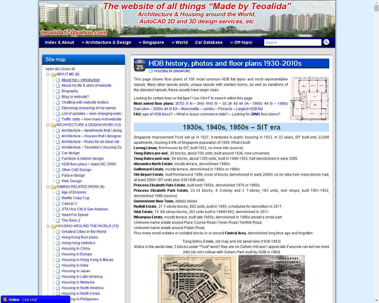
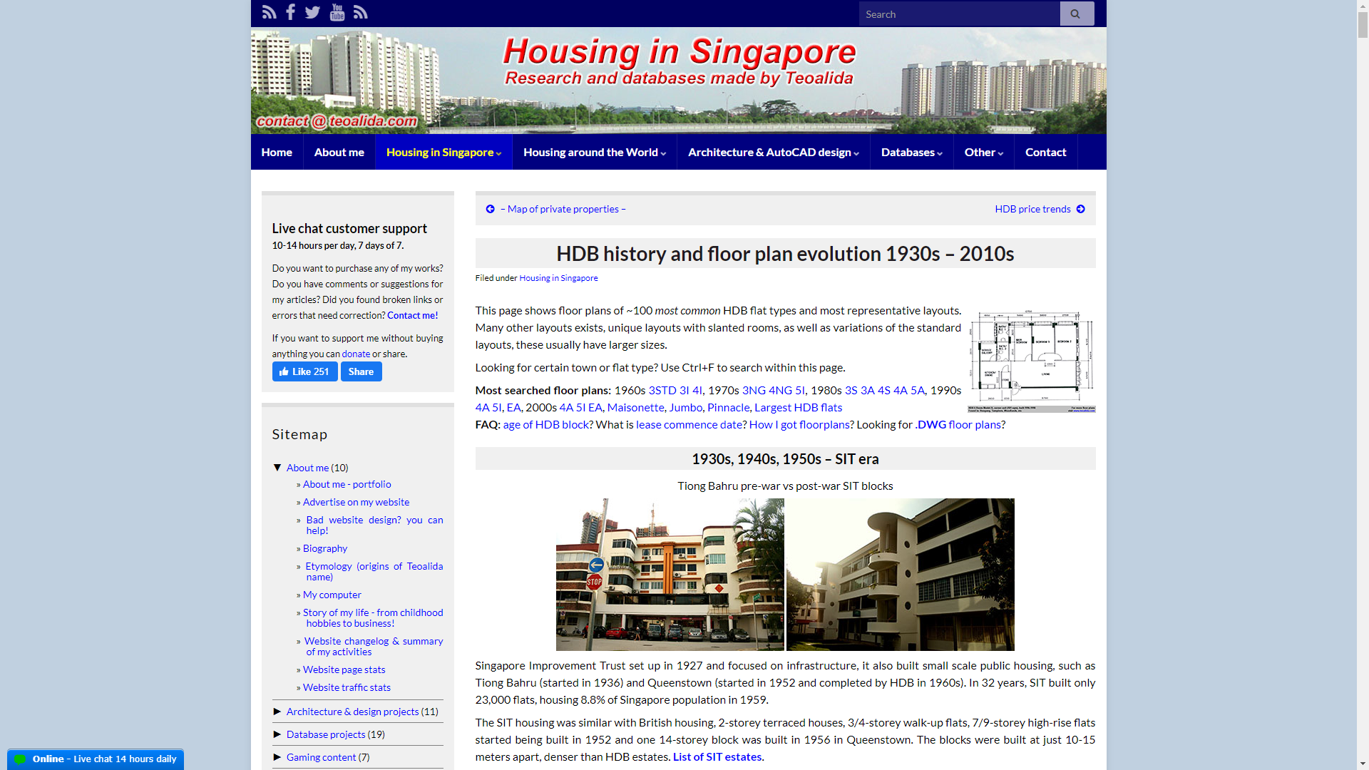
Also having lengthy pages with too text and too many images on each page, etc (the page Singapore HDB Floor Plans hold the record, 8000+ words article, 90+ floor plans images, 40+ photo images), but exactly this BIG content helped me getting audience, thousands of Facebook likes on HDB Floor Plans page, more than any other page of website.
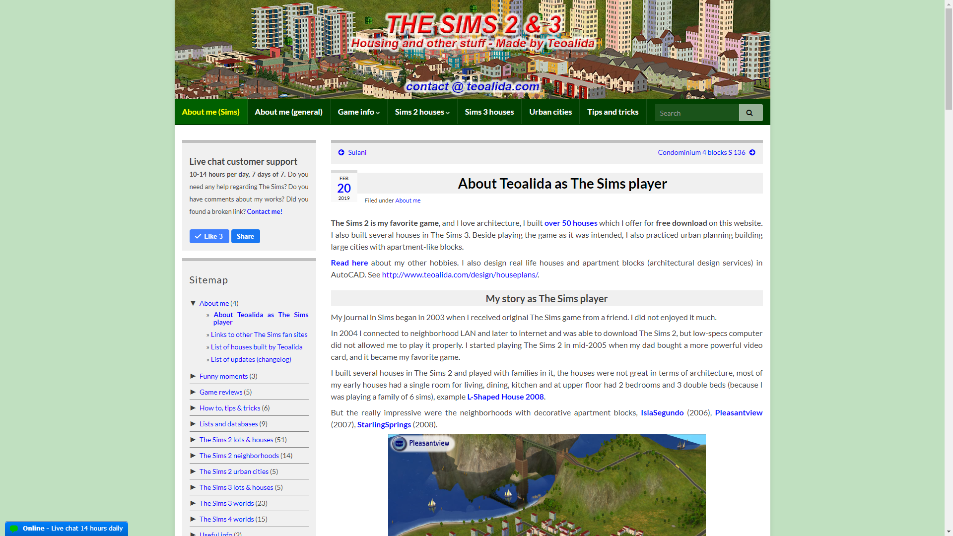
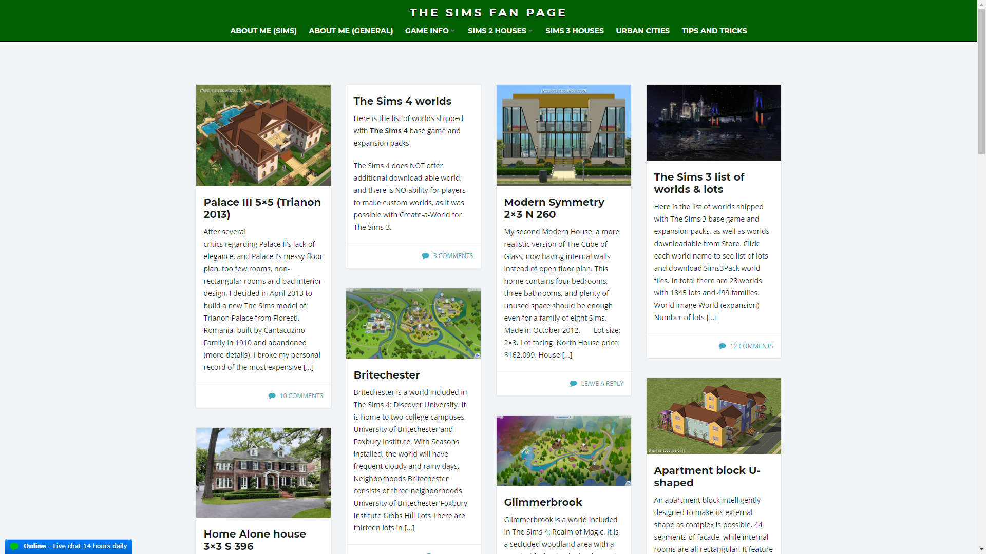
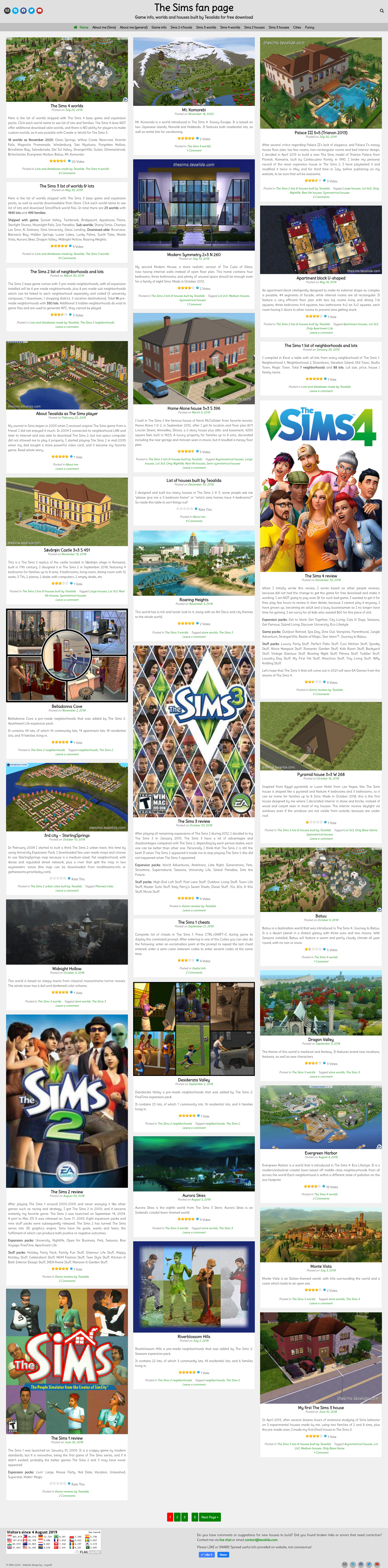
Take a look in www.teoalida.com/cardatabase or www.teoalida.com/thesims, sub-websites using same theme, but most pages have max 200 words and 6 images, are they better?
“above the fold” rule
According what I learned in 2009-2010, essential info must be put on the first 650 pixels of page (on the fold), most people have 1024×768 or 1366×768 screens, title bar, taskbar, etc, eat 100 pixels in vertical, so what is below than 600 pixels (below the fold) may be not noticed, people don’t bother scrolling down and may quit website if do not see good content within first 600 pixels.
In the last years I see more and more websites that break the rule, having with just few rows of text per screen… you need to SCROLL A LOT to read the essential info, that normally fits on a single screen. Example: https://www.elegantthemes.com/gallery/divi/ using my 1920×1080 screen I had to press Page Down 62 times to reach end of page.
This trend is probably driven by rising mobile users (mobile = small screen that fit just few lines of text) but on desktop and laptop computers who last years turned from 4:3 to 16:9 (same vertical but more space horizontal), such websites waste screen space and needing to scroll makes them HORRIBLE in my opinion.
Maybe mobile users are rising, but my website have 70% desktop traffic, most traffic being from universities and workplaces, where people use computers.
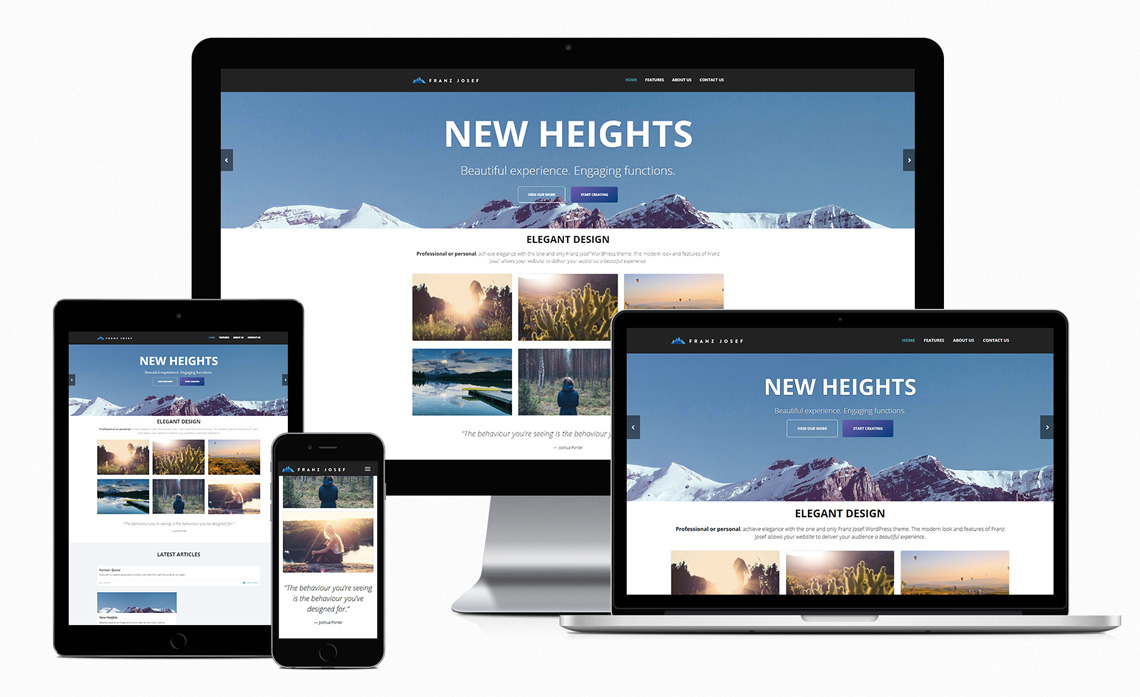
Graphene theme developers launched a second project, Franz Josef theme with a full-size image on home screen http://demo.graphene-theme.com/franz-josef/ and some of my website visitors said that I should use it, but it lacks features I need (such as full length posts on homepage) and there is NO premium version available. Franz Josef theme been abandoned in 2018 as they focus on Graphene theme which now include a PRO version.
Such themes with full screen image are good for a company offering ONE service or product, that do not need more than 5 pages (Portfolio, Pricing, Services, Blog, About us, etc). They are NOT suitable for content-rich websites like mine, will spread content over multiple screens and people need to scroll more. I agree that website may look better by removing large part of text and images, not need to change theme, but this will make visitors angry because the great content that they love will GONE.
Starting from 2009 a lot of content made myself (1-person work) was posted on website, visitors suggested to add more and more stuff, some people emailed me their floorplans “to contribute”, until the point when many people started complaining about website being cluttered and having too much info, thus decided in late 2012 to stop adding excessive more content, stop adding everything that comes in my mind or everything that people suggest.
My first website – teoalida.webs.com
My online friends encouraged me to publish my works on internet, so they could be viewed by anyone with a link, also to access my works from friends’ computers when I visit them.
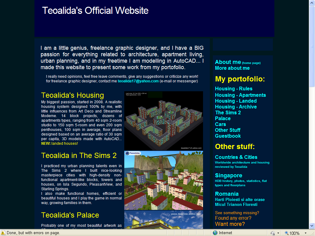
In April 2009 I created a website http://teoalida.webs.com that was to represent my image, making “Teoalida” name public for whole world. Assuming risk that my family may cut my internet connection, I was hoping that by the time they find my website, I will earn enough money and they will realize that publishing my works on internet was not a bad choice.
I had friends with blogs hosted on Blogspot and WordPress, posting their diary and stupid stuff, personally I wanted something more professional, a WEBSITE with static pages rather than a BLOG with posts sorted by date. Later I saw numerous professional blogs. Still, blogs are good if they cover one topic, newsy websites updated regularly, while my website cover multiple topics. In 2012 I realized that chosing Webs.com free hosting was a mistake, it lack SEO features and limited the potential growth of my website.
Website originally had 5 pages:
- Home page, with name, age, contact email, and a list of the following pages:
- Teoalida’s Housing (floor plans and 3D models of apartment blocks).
- Teoalida’s Palace (3D model in AutoCAD).
- Teoalida’s Cars (again 3D models in AutoCAD).
- Teoalida in The Sims 2 (house models built in a game).
- By August 2009 my website was completed, with 10 pages.
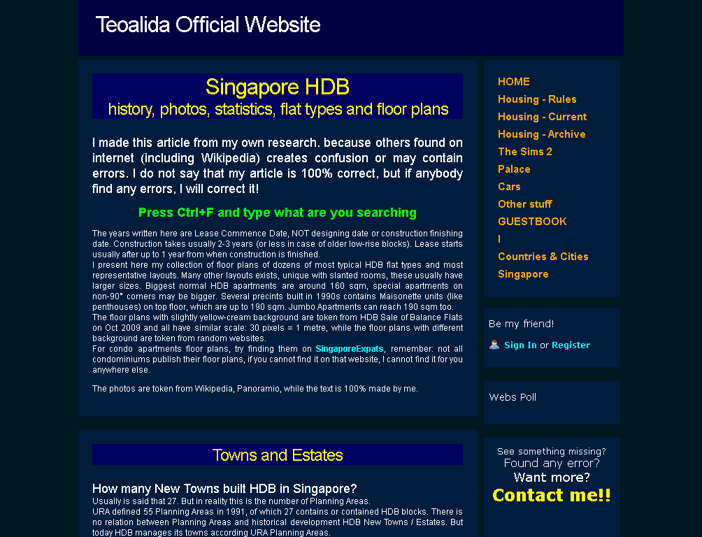
Because too few people are interested in my works and floor plans of imaginary buildings (perhaps architecture students and companies hiring AutoCAD designers), I decided in late 2009 to add more pages, to get more traffic and increase website ranking. Pages writing about real world: Countries & Cities (now Housing Around the World) and Singapore HDB floor plans which generated over 50% of traffic. I constantly added new pages and more content on existing pages.
My first website with blue theme (2009-2011)
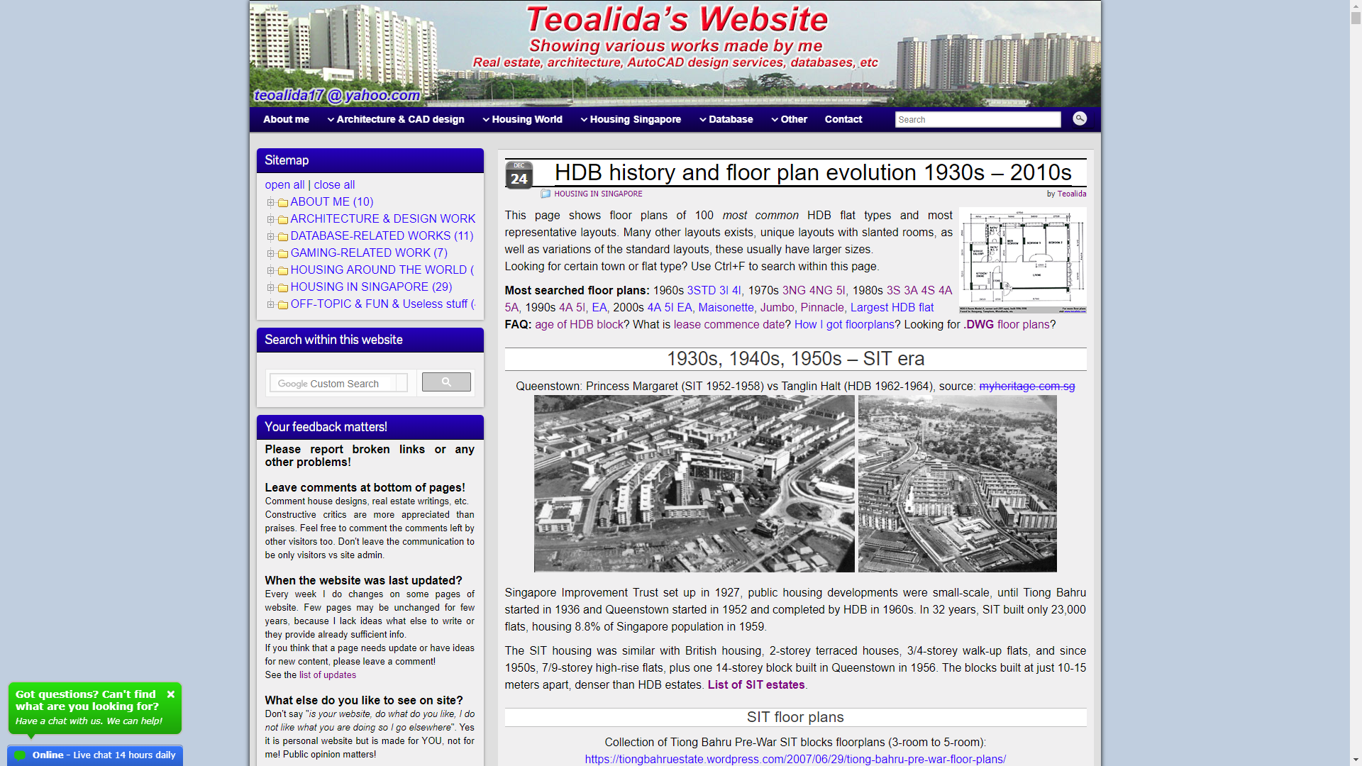
Left photo show my custom-made navigation bar vs Webs’ default navigation bar (right photo)
My first website with white theme (Jan-May 2012)

My first website after expanding navigation bar (since Jun 2012)
Was a good or bad idea?


Each page began with an introduction about myself, the first page was the “About Me” itself… this became a TROUBLE as the website grew beyond its original purpose. Many visitors were not interested to see personal biographies and stories, etc, this leaded a high bounce rate.
The purpose of website was originally to show off my hobby works to friends, NOT to get customers directly via website, instead I tried to get jobs in CAD design in forums and freelance websites where I linked my website for portfolio.
In early times I sucked at SEO, the visitor traffic was rising but Google sent the visitors in wrong pages and they quickly left (example: searching “Singapore 4-room floorplan” and landing in Apartment Design page, searching “100 sq m house plan” and landing in Singapore page).
Webs.com lack SEO features, I could not set different page title than URL or META description, the pages were originally named to look best in the navigation bar. But in 2010 I got idea to make custom HTML navigation bar, I could write anything as navigation links, and changed page title (which is URL too) to more SEO-friendly, as seen in above screenshots (example: Teoalida’s Cars > Car Design, Housing-Current > Apartment Design). Traffic went over 100 visitors per day and bounce ratio was reduced, but in 2011 it became neglected.
New website – teoalida.com – paid hosting and .com domain
Webs.com is one of the most-limited hosting services. See my own Webs.com Review. Beside lacking SEO features, free users get 500 MB monthly bandwidth (if you exceed bandwidth you warning messages to upgrade or you risk to be suspended, the actual suspension happens only if you exceed twice the limit, and last until end of month). My website reached again 100 daily visitors in January 2012 and exceeded these 500 MB). I upgraded the bandwidth to 1.5 GB in March… but in September 2012 I reached over 200 daily visitors and exceeded bandwidth once again. I had enough Webs Credits to buy 1 GB bandwidth 3 more times, BUT… is this is the RIGHT thing to do?
In 2011 I bought domain name www.teoalida.com but I could not attach to my website unless I pay Webs.com premium account. See also: a Funny chat with a IDIOT who blame me for not putting teoalida.com on Webs website!
In August 2012 I started to develop a new website based on WordPress platform, using domain name www.teoalida.com and hosted on 000webhost.com (free hosting with PHP support) and in October 2012 I transferred content from Webs, making website suspended 3 times due to too high traffic and high CPU usage so in November 2012 I upgraded to PAID hosting hosting24.com. I regret for not choosing a paid hosting earlier.
On the former website, the main landing pages were Singapore HDB Floor Plans (35% of total traffic) and Singapore BTO List (25%), all other pages were max 10%. The home page was the About Me page (because website was originally intended as personal portfolio) but it was landing page for just 3% of traffic (as 2012), mostly my friends or people who bookmarked the URL. This turned into a PROBLEM: many people reading articles about Singapore (60% of total visitors) though that my website is an encyclopedia or a real estate agency, being not interested in the person behind it, if they remember the URL and next day they simply type teoalida.webs.com, they will see the About Me page shows my portfolio, may go away thinking that typed wrong URL.
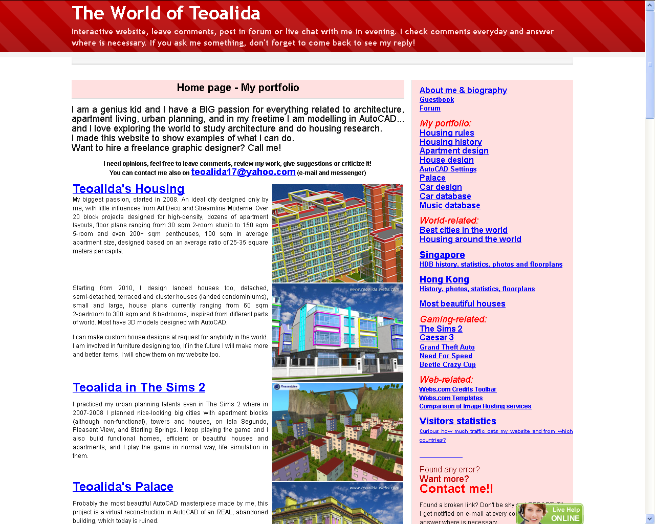
SOLUTION: for the new website I made About Me as a subpage, while on home page I put articles about Singapore real estate, to make home page main landing page and get ranking in Google, planning that after a year to put my architectural designs on home page, to do business. But architecture never been a successful business so the articles about Singapore will remain on home page… forever!
Sub-websites:
In February 2013 I rebuilt The Sims 2 (a category with 53 posts) as sub-website, separate WordPress installation, with own banner and own menus. Same thing done in April 2013 for Car Database (3 pages, which grew to 30+ pages as 2016). Why? Because people looking for a car database are not interested in the rest of my works such as architecture and real estate. Someone who is interested in American cars may accidentally click the menu World > North America, which is a page about real estate, no cars.
Screenshots of my website from May 2014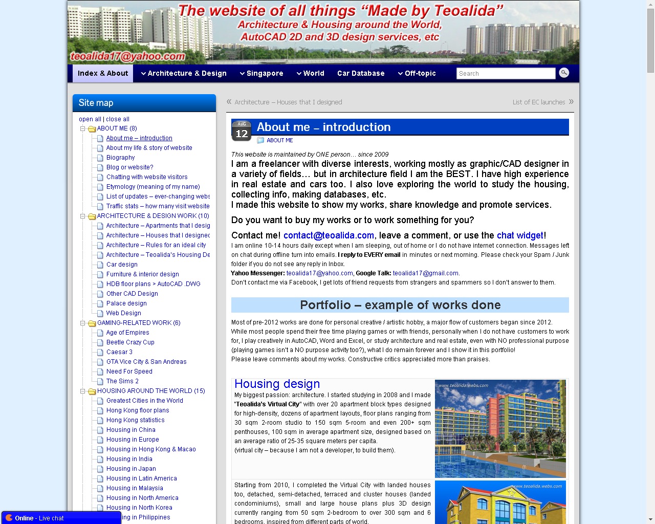
Themes used forWordpress website (2012-present)
My website’s main scope is portfolio of my works and provide information like Wikipedia, selling products and services is secondary scope. Actually in early years I attempted to design website like Wikipedia: left sidebar, articles with titles and few subheadings, photos aligned on right, etc (over time I aligned most photos on center and moved sidebar on right like most blogs).
These are my original requirements:
- Header and sidebar on left, NOT with a full-width picture on first page.
- Boxes of color for each post, sidebar widget, etc. I love this… as opposite of fully white background themes.
- A lot of customization options via graphical interface, for a NOOB like me with zero PHP knowledge.
I started using WordPress in August 2012 using Tarski theme, in October 2012 I found Graphene theme. I done a survey and people preferred Graphene.
In 2014 I tried to find a responsive theme that match above requirements, the ONLY ONE found was Suffusion (left photo) it does respond to window size but do not hide sidebar like a true responsive theme. I did another survey and people preferred Graphene again. So over next years I customized Graphene, and added a horizontal menu at top of website, beside tree-styled navigation on sidebar. (right photo)


The Graphene theme was dark blue since early 2014, links blue, some part of text red, but people complained that there’s too many colors, I changed them to gray in April 2015 (this shall be done in March 2015 at Lee Kuan Yew death), but other people complained about lack of contrast, I changed to light blue in April, then back to dark blue at end of April…
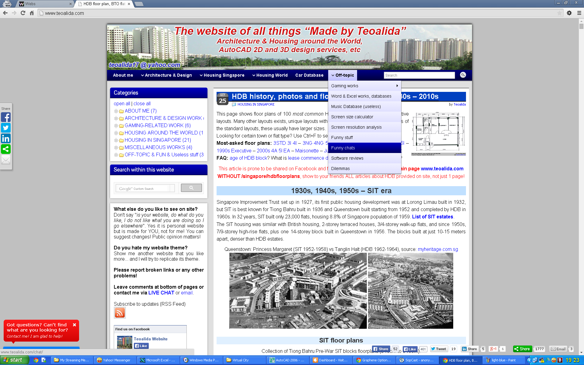


On 27 June came with idea to remove blue background from article titles and use horizontal lines instead, also I changed background to gray instead of white, also removed BOLD from titles and enlarged font size instead, from 20 to 24 and small titles from 18 to 20 (inspired from what other websites do, bigger titles). Was this a BAD decision?
One of these changes (most likely removal of prev/next pots links) had negative effects increased bounce ratio. I restored the blue theme, then in July tried 2 more options. Every weekend I done a small change, testing effects on visitor behavior of each theme, week by week. Also figured out how to make page titles and in-page headings gradient like widget headers.

 a
a
Using WP Mobile Edition (2016)
In early 2016 been rumored that Google will penalize websites that are not readable on phones, downranking them when user search something on mobile devices. Since Graphene is not responsive, I installed WP Mobile Edition plugin that automatically switch to a different theme when visited from mobile devices. The downside of this is that the mobile theme did not displayed sidebar widgets were I placed code for Clicky and for chat widget, effectively preventing visitors to contact me from phones, unless they click the switcher at bottom of page to see desktop theme.
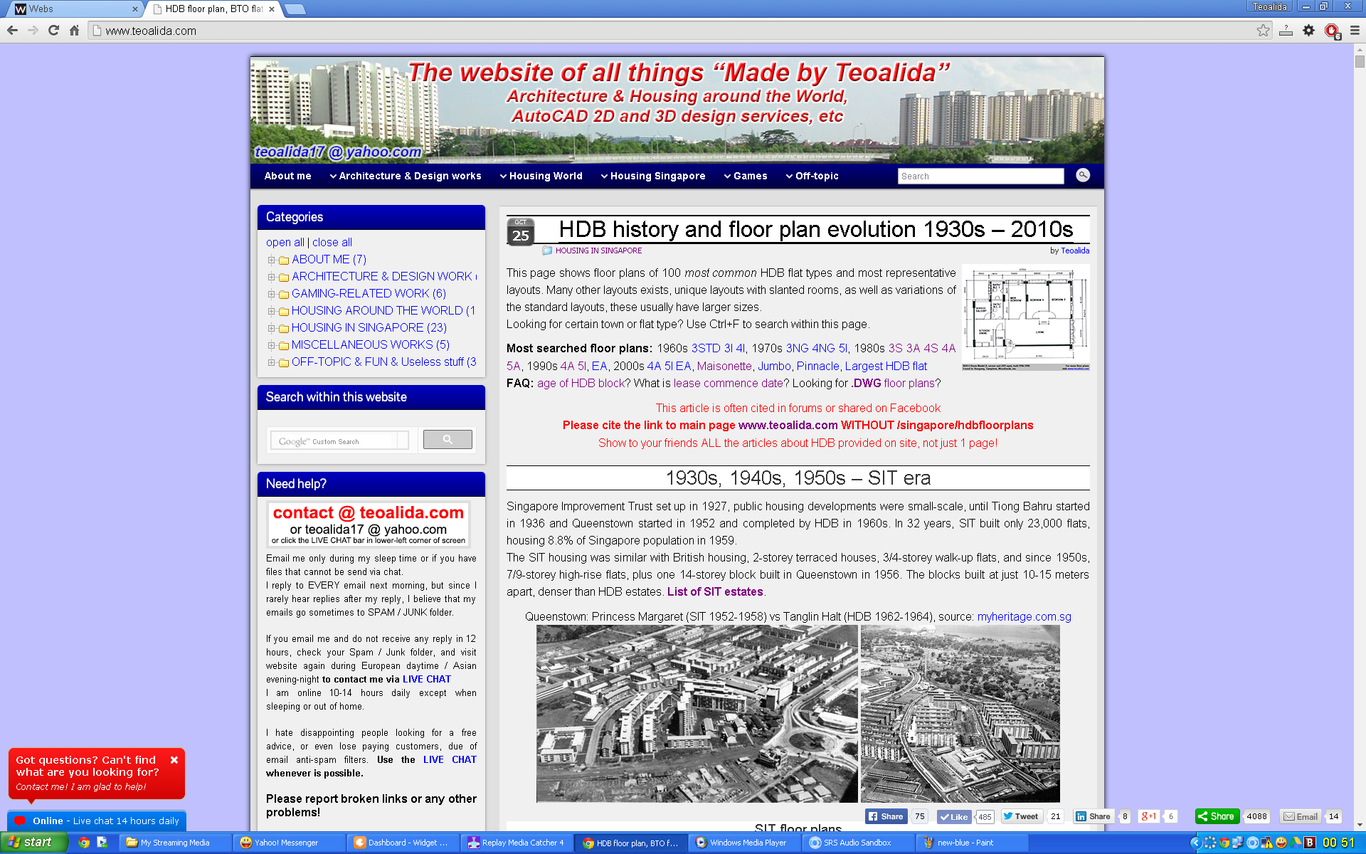
After doing many small changes over time, I came to THIS (October 2017):
Switching to Graphene 2.0 theme (2017)
After years in which I desperately tried to find a responsive theme that is similar with the highly loved Graphene Theme, in October 2017 Graphene developers launched Graphene 2.0 with Bootstrap responsive framework replacing 960.gs grid system.
I updated my website theme to 2.0 and finally I had a responsive website that looks good on both computers and mobile phones. Once again, I added custom CSS to make different shades of gray for sidebar, titles (to differentiate from white background), customized fonts, spaces between paragraphs, tables, etc.
Probably most of you liked navigation bar to be on left side. Me too, but HAD TO put it on right side because when viewed on mobile phone (or small browser window on computer), left column appear at top and right column under it (a theme update made sidebar to appear on phones below main content, regardless of side.
Below screenshots shows the LAST version of Graphene 2.0 theme
(March 2020, just before changing to Kaira theme).
 a
a
Attempts to find a better theme (early 2020)
Even with responsive Graphene 2.0, people keep criticizing my website for being ugly, ancient, designed in 1990s “is so poorly designed that at first impression I though that is a SCAM site, but I gave a second change and saw that you have great products“
My requirements changed now, because…
Over years, traffic moved from computers to phones, search engines algorithms evolved, thus having a fast loading website with post excerpts placed in grid or masonry layout is better than having 10 full length posts on home page, to get as many keywords is possible.
On Graphene I made an banner image with site title and email address to protect it from SPAM, but many people did not paid attention to banner and asked what is my email via website chat, other people complained about lack of button to homepage, the did not realized that clicking banner go to homepage. So banner was useless, it eat screen space and slowed down website with a fraction of second. I wanted now a theme without banner.
My attention went again to Franz Josef, I set up a temporary site and made a mock-up with that theme to ask website visitors what they think about it. Most said that is much better than Graphene, but it lacks social media buttons and have some compatibility bugs with latest WordPress version. Franz Josef development been stopped in January 2018 to focus on Graphene (free) and Graphene Plus ($55/year), which add option of masonry layout and more customization. While Graphene Plus may solve my needs, I do not want more comments about bad website design. Thousands themes been launched over years and I think that there may be better options.
Switch to Vogue theme by Kaira (March 2020)
While looking through WordPress themes, I came across Overlay theme by Kaira. On 1 March I emailed https://kairaweb.com/wordpress-themes/ asking to recommend me a theme having a couple of features, because they made 12 nearly-similar themes and I did not had time to test all myself. He recommended me Overlay theme which is their newest product with lots of customization options, being newest product it do not have yet a DEMO that I can test before purchasing (their other themes have DEMO where I played with configuration and made sure that suits my website).
I bought Overlay ($35 – license for 5 sites) but it lacked 2 features I need (ability to put social buttons left/right side of website title, they were in top bar above title and this added few unnecessary pixels from screen space, and ability to exclude certain categories from blog homepage). Kaira agreed to exchange Overlay with another theme, so I choose Vogue, received on 13 March.
On 15 March 2020 I started redesigning website and made a VIDEO to show process
a
- Took few hours to add featured images for all posts, and manually write post excerpts (WordPress allow by default excerpts but it chose first 55 words (or other number) from each post. Kaira themes as well as most themes, you MUST add a feature image to show it in post excerpt. Graphene theme excerpts automatically pick 1st image from post (is possible to replace them by adding a featured image chosen by me).
- Moved sidebar to right because it seems to be more popular on blogs (in contradiction with email services having sidebar on left).
- Beside theme change, someone advised me to use tinypng.com with it I could reduce size of my PNG images with 60-70% compared with the size generated by saving in Adobe Photoshop.
- I also want to switch from All in One SEO pack to Yoast SEO plugin which seems that its popularity increased last few years.
- Once I finalize website redesign, I make home page blog full width (removing sidebar from homepage, still showing on posts).
- In the future I will continue to do changes in CSS code and colors to reduce number of people complaining about bad website design.

 a
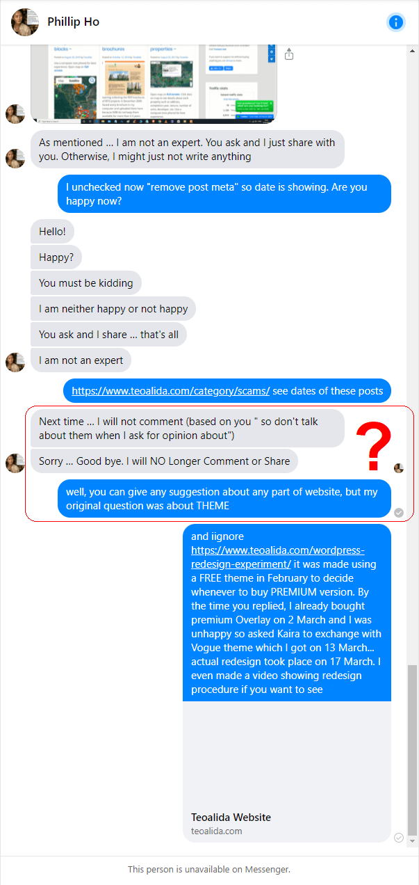
aA detailed review from Philip Ho
One of my Facebook followers left a comment HERE and via messenger he wrote a detailed review / suggestions, including adding post dates, which I did, and he immediately blocked me on Facebook. WTF?
l feel sorry if I offended you by saying that you confuse THEME with WIDGETS and that’s why you blocked my messages. Actually I should THANK YOU for giving me most detailed review but I hardly understand what are you saying, you didn’t even let me to finish replying and do the changes you suggested and ask your confirmation if is OK.
 a
aPhilip said:
Sorry for the Delay in Reply …
Links & Post in Facebook (or other Social Media Platforms) is a good way to redirect sequentially on a timeline to WebSite such as https://www.teoalida.com/ (Original) or https://www.teoalida.com/wordpress-redesign-experiment/ (Revised).
A note to add:
My initial question asked on 2 March on https://www.facebook.com/teoalida/posts/2983650934979493 was if Overlay FREE theme by Kaira installed on https://www.teoalida.com/wordpress-redesign-experiment/ is better than Graphene https://www.teoalida.com/ to decide if is better to purchase Overlay PREMIUM theme or Graphene PLUS theme. By the time you replied I already purchased Vogue PREMIUM theme from same Kaira, https://www.teoalida.com/ is revised and FINAL, the original (Graphene) design cannot be seen anymore except in archive screenshots in https://www.teoalida.com/about/website-design-history/. I PM-ed you on 16 March that I am currently revising www.teoalida.com and asked you to suggest changes, your detailed suggestions are welcome but DON’T use redesign experiment from February for comparison because is a DRAFT and nothing final.
Philip said:
On Preference: I prefer the 4 columns as in Orignal compare to Revised (narrower). However it (Original) does not have date – Old Information is mixed with New Information (unless they click and go to the specific page (Example: https://www.teoalida.com/singapore/hdbmap/). Date is also not mentioned here unless there are comments which leads people to estimate when it was posted. Comments and Feedbacks should preferably remain in Facebook instead on your Webpage (unless it is necessary; some pages need not have comments or webpage – Dates on the Feedback suggest it is not updated and information is old. Some of these old information can be discarded and summarized into bite-size Knowledge for Decision-Making (surfers).
My comments:
Most people are interested in date of last update, you are only one concerned about date when each page been posted, can you please explain WHY?
I enabled post dates and asked if you are happy and I do not understand your reaction “Happy? You must be kidding”. I was expecting to NOT be happy because you see that dates does NOT indicate actual date of publication, I modified dates in so manner to show most popular posts at top, while the Funny chats had dates set in year 2000 before redesign, now I moved dates 100 years backwards (1912-1920) to appear below normal articles but maintain order in which they happened. WordPress is showing post date by default, in the experiment, the dates are visible because I did not spent much time in theme configurator to hide them, in the final version I HIDE post dates. Where been necessary, I wrote inside article the date of first publishing and last update..
Also, I do not understand what do you mean about old and new information and about Facebook, are you suggesting to replace WordPress comments with Facebook comments? Some people do not use Facebook at all and many people who use Facebook do not want to expose their profile on websites like this, so will reduce number of comments significantly. WordPress allow people to comment anonymously, without even leaving a valid email.
Philip said:
Both Sites suggest that you have the Knowledge and Experience in Work related to Design & Architecture. However there is not much Difference on both – Information are all over the place and Information that are not Categorized. I am not suggesting that you make a change but am sharing with you example of Categorizing Tools; which Directs and Connect Ideas:
1) MindMap
2) Prezi
Once you have Categorized Information into Specific Needs, different Surfers (or Consumers) would Directly goto the Knowledge Base. Currently, on a Single Page (Main) Information appeal to All users regardless of local or overseas unless they click one they are interested in – That would direct them to that Single Page. Webpages should be as simple as possible and the information should preferably be direct.
Example (Categorizing): On Top-Menu you could have included “Pricing” – This Category separates or dofferentiate those who entered your Webpage for buying instead of seeking information.
My comments:
I do not understand the above 3 messages. You can click menus to filter articles by category. A page “Pricing” is suitable for websites offering a single service. Someone else also suggested to make a page “Services” and indicate price of each, but now too many people attempt to hire me to make new projects, evaluating project and making a price offer is wasted time if customer don’t agree to work with me, so I rely on selling complete projects, like an online store. Have you seen online stores with a general Pricing page instead of clicking each product and see its price? In the same time I do not want to show prices on homepage because will scary people thinking that I offer only paid information.
Philips said:
I am not an expert in the producing WebSite and I must say you have better flair. I am just a surfer and from one providing feedback. I hope you are doing well and reach greater heights.
Arrow shows unwanted Comments and could be instead on Facebook. Quality Feedback & Comments remain and should not be made available on every page on your WebSite
An Example of Simple WebSite https://aboutlearning.com/about-us/4mat-overview/. Noticed: Recent Post, Comments and Past Comments at the Side. On this Page there is only One Theme which can be Redirected via Menu at the Top. At the bottom, there are Shared-Links to Social Media such as Twitter, Facebook, Email (Can Replaced Feedbacks and Comments – which you do not want other people to see; Arrowed mentioned previously) …
My comments:
aboutlearning.com is made with default WordPress widgets. I also had Recent posts and Recent comments, but disabled Recent posts because it would show same 5 pages all time while I am adding new posts with backward date (this is NOT a news website), Recent comments would have been useful IF comments were positive reviews from my customers, but unfortunately most comments are from spambots and human spammers posting comments linking porn and other dodgy sites, plus the kids who find my website while looking for info for their school projects, some of them are so bored in classroom and post pointless comments sometimes with vulgar language. Having a Recent comment widget will make these bad comments appearing on all pages until I have time to clean them, which makes more worse than benefit.
I do use Akismet that blocks 99% of comments from spambots, a CAPTCHA may block remaining 1% spambots but won’t block human spammers and kids, while legitimate humans using VPN may not be able to solve CAPTCHA.
Switch to Neve theme (2021)
The main things that I (and my visitors) did not liked at Vogue theme, were Header and Footer, which had few standard templates, none of header options had search box in sticky menu bar as I wanted, and at footer I had to choose between “social footer” putting social links on center, and “widget footer” that allowed up to 4 widgets side by side, and social links were in footer bar in lower-right corner, where been covered by my live chat widget.
KairaWeb.com launched a new theme (Elation) in late 2020 and I could make another step forward by switching to it, but I attempted to make a BIGGER step forward so I installed few themes on a test website and in February 2021 I bought Astra theme because it is rich in customization and have over 1 million users, but it turned to be a step backwards: it lacks some features I need.
I continued to test themes and ended with about 20 themes installed on a test website, best of them were ThemeZee, Kadence and Neve. All them have customizable header/footer so I could place any piece of info anywhere I want, I emailed all asking if premium versions include specific features I need, none had ALL features but Neve was most comprehensive… so I bought it on 1 May 2021.
Video showing the process of installing Neve theme and configuring it.
a
Switch to Gutenberg (2023)
When WordPress 5.0 was released in December 2018 with Gutenberg editor, it got so much negative feedback, thus I stayed away from it and I installed Classic Editor plugin so I can edit my website like on WordPress 4.x.
Over years, Gutenberg editor was improved and in 2022 I tested it for first time, but only in May 2023 I started using it on my public website. With Gutenberg I can easily arrange content in columns side by side, use background color for each section (including gradient), add animations, etc, without wasting time coding myself.
Story to be continued…
Hey!Assalamualaikuum Cik Bedah here! I just wanted to be a kaypo and ask you if you could redesign your website to fit in with my irritating-ness. I know this task is hard to fulfil as my personality is difficult to duplicate into drawing form. Also, you should provide more baking tips to your readers as many of your readers are my mak cik friends who are ‘expert’ bakers. Actually, that’s false. So, in order to help their families, I am advising you to put never-before-seen tips on how to bake on your website. PS: I got 50 people reading your website. NO HATE AT ALL. All love :3
Some people have no lives!
IKR LIKE OMG
You left 3 stupid comments and sent 3 messages on chat while I was offline, with invalid email… do you think that I take in serious your bullshit?
I think the first thing you need to do is reflect on yourself n how you want to present yourself in your writing, design, and your website.
From what I’ve read so far, I find that you are indeed knowledgeable, but you are quite full of yourself. Instead of taking others advice (stupid or not) you rather write a long story to justify how your decisions. Come on. No one cares about how much you went through to do up your super awesome site… Which it is not.
Instead, spend time thinking what consumers n readers WANT TO SEE. Do you really think they want to see grandfathe stories or do you think they would prefer to get straight to the point? It’s the latter if you still can’t figure it out.
Why are you saying “Instead of taking others advice”? Did you gave me any advice and I did not followed? I invite everyone to give advices and taking decision only after talking with multiple people.
I checked pages viewed and you appear to have opened ONLY https://www.teoalida.com/about/website-design-history/
Maybe another day you visited from other device https://www.teoalida.com/about/lifestory/ so that’s why you mention grandfather stories. Usually people who know me in real life read that page. You don’t need to read all if you are not interested in my personal life, read only what you are looking for.